
This post on flower photography is written by Harold Davis, as a part of a series, showcasing talented photographers, who use Pixsy to protect their work from being stolen. Sign up for your free account here.
I am often asked to explain my Photographing Flowers for Transparency technique. At the outset, to avoid misunderstandings, “transparency” is a misnomer: the goal is to create an image that mimics translucency. This is because absolute transparency is simply not possible—because you’d be able to see right through the subject matter—when the goal is to create a photographic print on a reflective substrate.
I do continue to use the word “transparency” to describe my process because everyone understands what I mean. However, it is important when embarking on this road to be aware that 100% transparency is not actually possible—translucency is to some degree an optical illusion caused by the juxtaposition of lighter and darker tones, arranged as determined by the composition.
How does “transparency” occur?
The illusion of translucency is created by contrasting lights and darks in the apparently overlapping subject matter. Breaking down a high-key subject into separate layers allows specific and pinpointed control of the darkness and lightness in each layer and across the entire range of subject matter. When the audience looks at the final image, the vagaries of human vision and the interpretation of the human optical system and brain “sees” it as partial transparency.
Over a number of years, I have experimented with a variety of photographic and post-production techniques, including HDR (High Dynamic Range) photography, solarization, simulated x-ray photography, various forms of cross-processing, IR photography, LAB color manipulation, and lightbox photography. The methodology I developed for Photographing Flowers for Transparency (or translucency) is based on this experimentation, and can really be better described as a “process” with multiple steps.
What are the steps to mastering the process?
Surprisingly, it combines classical photography and modern digital best practices of flower photography. When applied with a dedicated, delicate, and skilled hand, the results can be luscious and luminous. Here’s how my Photographing Flowers for Transparency process works out, step-by-step:
- Understanding the role of the lightbox
- Selecting and arranging flowers on the lightbox
- Photographing a high-key bracketed sequence of exposures
- Combining the high-key bracketed sequence to express transparency
- Finishing the image in post-production
- Creating a high-quality print of the transparent flower image
Let’s take a look at each of these steps in order.
Step 1: Understanding the role of the lightbox
What happens if you photograph an object, whether it is a person or a flower in a vase, normally on a white background? If you have experience in studio photography, you’ll know that a white background is rendered as gray when you properly expose for an object in the foreground—unless you establish separate lighting for the white background to balance the exposure.
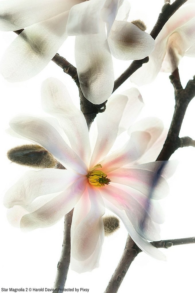
One of the most important purposes of using backlighting via a light box is to create a “true white” background in the final result. Of course, the other goal is to promote transparency in your floral subjects, particularly the petals.
I do get asked all the time what kind of lightbox to use. There are many options, with the most common light sources being daylight-balanced fluorescent tubes and LED lighting. This choice is not really as important as you might think, since (provided you are photographing using RAW) you can adjust color in post-production.
The Photography Flowers for Transparency FAQ on my website includes information about a number of commercially available sources for light boxes, and plans for building your own using inexpensive materials.
Step 2: Selecting and arranging flowers on the lightbox
“Want to make your photos less boring?” asks the pundit. “Then stand in front of more interesting things!”
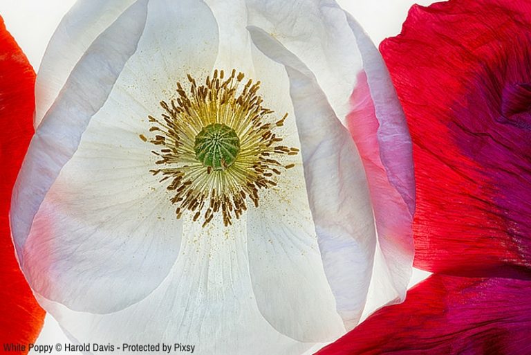
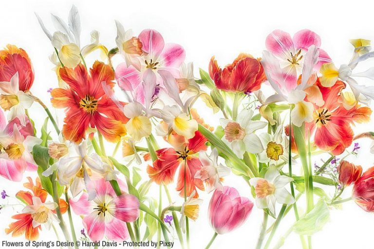
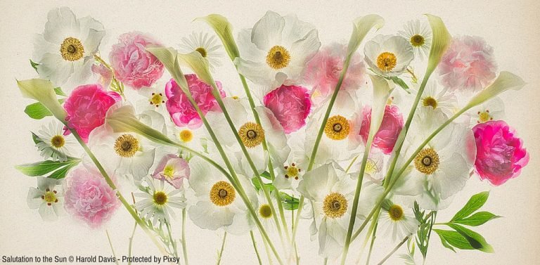
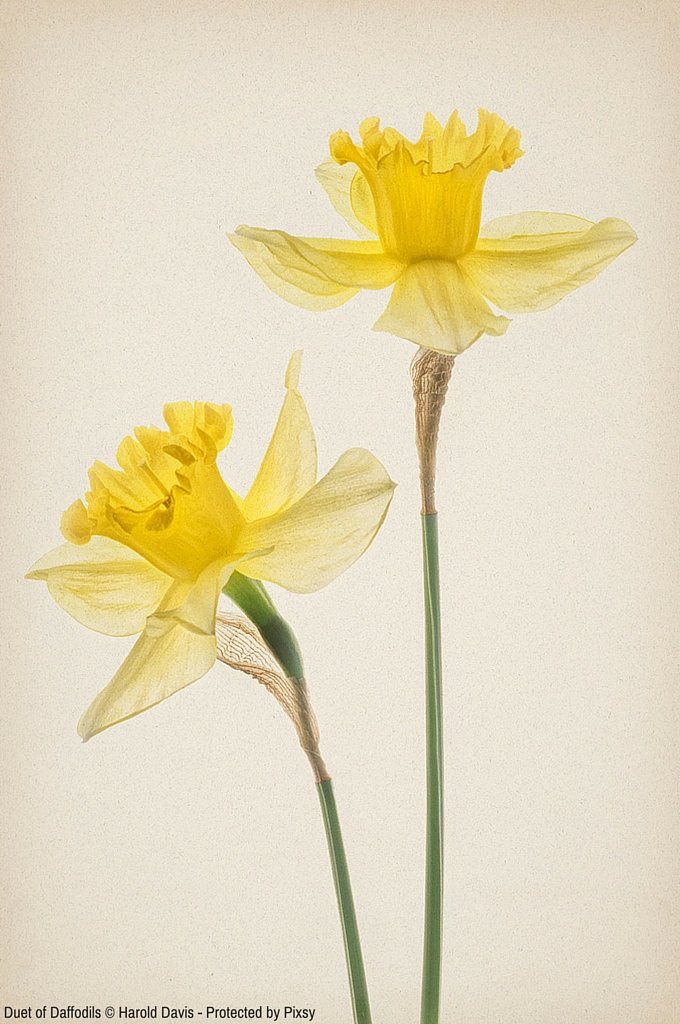
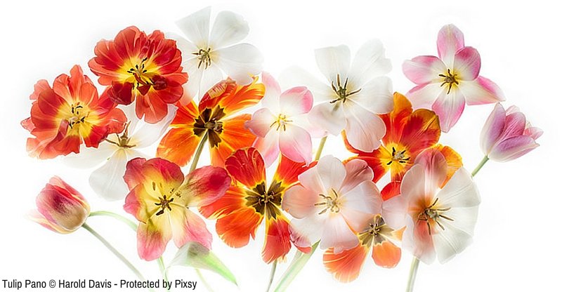
In the same spirit, the most important part of Photographing Flowers for Transparency is undoubtedly floral selections and arrangement. For one thing, if you want to create an image that illustrates transparency, then you need to choose flowers with translucent petals.
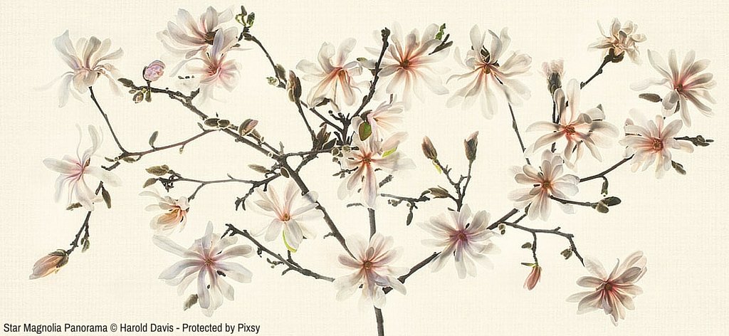
It turns out that many of the best kinds of flowers for this process—anemones, tulips, and particularly poppies—are not generally available from florists. In many cases, these kinds of flowers also don’t have great longevity. So you may need to make an arrangement with a local flower grower, or better yet, grow something such as an exotic poppy yourself.
In Japan, it is often believed that floral arrangement is the best expression of a refined mind. Ultimately, flowers photographed for transparency on a lightbox will be no better, and no worse, then their arrangement. So to master this technique the best way you can prepare is by learning about floral arrangement—perhaps by taking a course in Ikebana, the art of Japanese floral arrangement.
Step 3: Photographing a high-key bracketed sequence of exposures
This technique works best with your camera on a tripod so the images in the sequence will be aligned. Use manual exposure. Take a light meter reading to determine what the camera thinks is the proper exposure. This will essentially be the center of the exposure histogram and is your starting place.
You are not interested in anything darker than this starting exposure (which is the reason the exposure sequence is called “high-key”).

From your starting exposure, begin manually bracketing shots, using shutter speed to bracket. Each exposure should be +1 EV from the last one. When your image as seen on the LCD is almost completely white, stop the exposure sequence.
A typical light box exposure at ISO 100 and f/16 might be from 1/40 of a second to 4 seconds, and include ten separate exposures.
Step 4: Combining the high-key bracketed sequence to express transparency
When you shoot a bracketed sequence of a high-key backlit subject, such as flowers on a lightbox, the idea is to break the exposure range down into individual components. This way you can capture an entire extended exposure range as takes place in conventional HDR. In post-production, the process that occurs is the inverse of this: building the discrete exposures back together using layers to create a single image.
I liken this process to singing harmony with a choir. Each individual voice is performing one part of the music, but when they combine they are seamless and create a musical whole.
A Photoshop layer stack is used to create the transparent image. A layer stack is a combination of Photoshop layers placed one on top of the other. If the layer stack is created from a bracketed sequence of imagery shot for HDR, then the layers are usually precisely aligned. A layer’s Blending Mode specifies how the pixels in the layer inter-operate with the pixels in the layer beneath it. Besides choosing a blending mode, it is possible to adjust the opacity of a layer and to wholly or partially mask it.
There are many ways to stack layers in Photoshop. The simplest is to use the Move tool to drag on open image over another open image, creating a two-layered Photoshop document. If the Shift key is held down at the time of the drag-and-drop operation, then the boundaries of the layers will be precisely aligned (assuming they are the same size and your camera didn’t move during the primary photography).
A sequence of images can also be exported to Photoshop as layer stack from applications such as Lightroom and Adobe Bridge.
Basic operations with layers and masking in Photoshop are beyond the scope of this article. Please see my Photoshop Darkroom and The Way of the Digital Photographer if you need help with these operations. But the general idea is to start with the lightest layer, which should be almost completely white. Details from subsequent darker layers are then masked in using the Brush Tool to preserve the illusion of transparency.
Note that there is often no benefit to processing a high-key bracketed set of exposures through an automated HDR program. The results of this additional process are then selectively processed in, both to add dynamic range and details.
Step 5: Finishing the image in post-production
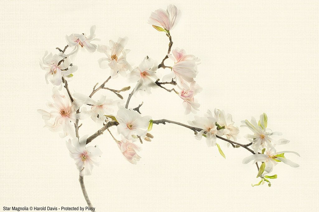
Once you have an image processed for transparency on a white background, there’s a great deal of flexibility with what you can do with it. Of course, you may decide the image is fine as it is on white. Otherwise, the next steps will depend upon your creative visualization.
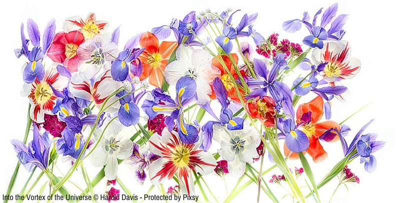
Some possibilities are to add a background or texture or to create a LAB inversion of the original image.

Both backgrounds and textures are used as part of the process of finishing a digital image towards the end of a workflow in Photoshop (or another design program). As such, they should be an important tool in the toolkit of every photographer or digital artist who uses Photoshop.
A background is an image file on which the primary image is placed to add interest and compositional completeness to a primary image file. Examples of background files that have been successful include canvas, exotic papers, and so on. Note that the image file is placed over the background and that the background normally extends beyond the primary image.
In contrast to the background, which resides under the image, textures can be placed over the image, and are therefore also called “texture overlays.” In conjunction with the creative use of blending modes, texture files essentially become a kind of unique, one-off filter, enabling original and unique effects, and changing (and enhancing) the characteristics of many kinds of imagery.
When I am looking for a ‘straight’ photographic effect, I probably won’t be thinking about textures. Textures come into their own when the point of the image is to be partially ‘painterly’, in the most general sense of the term. This is often the case with many botanical images, such as my flowers photographed for transparency.
Understanding the creative use of LAB color in Photoshop unlocks a vast treasure trove of under-utilized and under-explored possibilities. LAB is truly one of the secrets of spectacular color in Photoshop. If you know how to work creatively with LAB color in Photoshop, you will far ahead of the game in terms of getting the results you want. The key use of LAB when working on a transparent flower image on a white background is to invert the image, so it appears dramatically in final form on a black background.

Step 6: Creating a high-quality print of the transparent flower image
I never feel that my work with a transparent flower image is done until I’ve figured out how to make a great print of the image.
When you print an image you see things you just don’t see when an image is presented only on a computer monitor.
An image viewed on a computer (or mobile device) is inherently seen in the context of backlighting. It’s therefore not completely fair to judge the translucency of an image until it has been printed on a reflective substrate that doesn’t inherently send light through the image. When an image photographed for transparency works well as a print, it really ‘sings’.
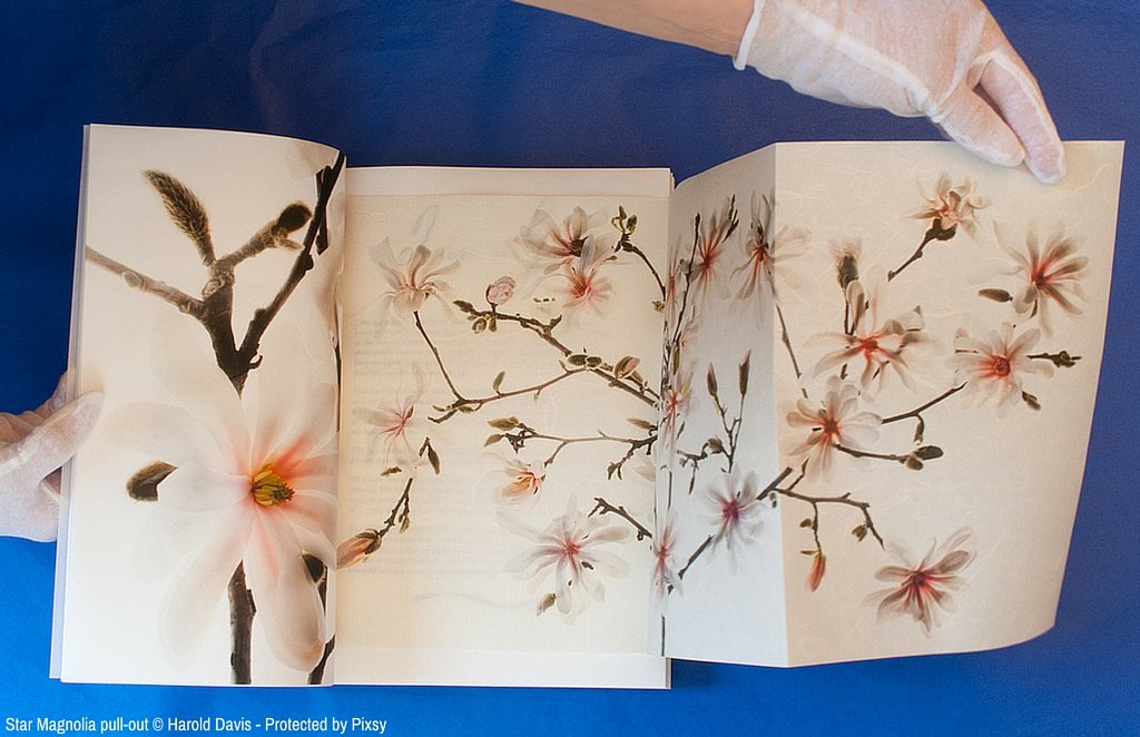
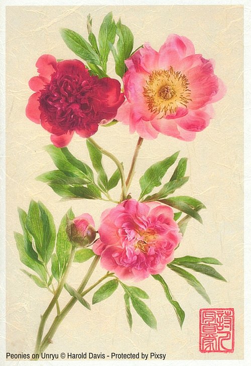
I like to match my images to the paper they are printed on, which sometimes means that I embrace fairly exotic materials. I often print my transparent floral images on Moab Awagami Unryu, which is a very decorative Japanese washi.
At the other extreme, some images look spectacular on a pearlized metallic paper, such as Moab Slickrock. The extreme dynamic range of a paper like Slickrock supports an almost multidimensional look, which can help enhance the feeling of translucency.
Harold Davis is a noted photographer and digital artist whose work is widely published and collected, and the author of eighteen bestselling photography books, including Photographing Flowers (Focal Press). His website is www.digitalfieldguide.com. Resources on Harold’s website include his blog, webinar recordings, FAQs, and information about upcoming Harold Davis workshops and events.
Text and images © Harold Davis. All rights reserved. Sign up for Pixsy to protect your work.


